Quote Management System for Commercial Insurance Broking
Taming one of the most complex B2B workflows there is - capture a corporate risk, build and benchmark a quote, advise on the gaps, compare insurers, and place the policy - in one guided pipeline.
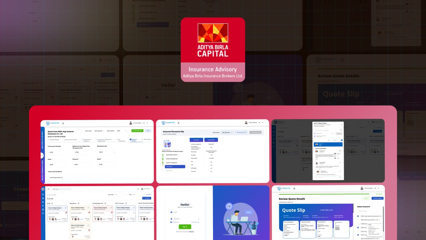
- Role
- UI/UX Designer (end-to-end)
- Client
- QMS
- Type
- Product · B2B InsurTech (Broking)
- Platform
- Web application (desktop-first)
TL;DR
Commercial insurance broking is one of the most genuinely complex workflows in B2B. To place a single corporate policy, a broker has to capture a multi-location, multi-cover risk; build an accurate indicative quote across sections, add-ons and clauses; advise the client on where their cover falls short of the market; choose which insurers to approach (and justify it on solvency and claim-settlement record); collect and compare the insurers' responses line by line; run internal approvals; and finally place the policy and bind the risk - all under turnaround pressure, across a team, on dozens of quotes at once. Most of that lives in spreadsheets, PDFs and email threads. The design problem was: take that sprawling, opaque, multi-party process and turn it into one guided, benchmarked, collaborative pipeline a broker can actually drive to close.
My role & contribution
- Owned UI/UX end to end, working closely with the MD, product managers and developers through discovery, design and build.
- Translated existing spreadsheets and written business requirements into a coherent product IA, since the workflow had never lived in one system before.
- Ran design conversations with approvers who understood the overall business workflow, to validate sequencing and gating logic against how quotes actually move.
- Mapped what could be carried over from the legacy system it replaced (a much older, harder-to-extend tool) and what had to be redesigned rather than ported.
Motivation
Commercial broking ran on spreadsheets, PDFs and email, and a legacy system that was too old to extend. There was no single source of truth for a quote, so brokers held the whole risk in their head across tools. The brief, worked out from business requirements and conversations with people who understood the workflow end to end, was to give that judgement a system: sequence the complexity instead of hiding it, put market evidence at the point of decision, and make comparison and collaboration part of the tool instead of side channels around it.
The core challenges
- 01Domain complexity that resists simplification - sections, sub-limits, perils, add-ons, clauses, per-location sums insured. The design had to organise complexity, not pretend it away.
- 02Advice, not just data entry - a broker's value is judgement; the UI had to surface benchmarks, gaps and insurer quality so the tool supports the recommendation.
- 03Multi-party collaboration - brokers, underwriters and approvers work the same quote; threaded, section-anchored comments and approval gates had to be first-class.
- 04Comparison at the core - broking is fundamentally comparison (expiring vs renewal, insurer vs insurer); rendering many quotes side by side, legibly, was central.
- 05Pipeline visibility under TAT pressure - with hundreds of open quotes, the broker needs to see what's where and what's stuck.
- 06Accuracy and traceability - real money and exposure mean every number (pricing, GST, sum insured, location breakup) must be computed, visible, and defensible.
Design solutions
Capture the risk and build the quote
The heart of the product turns an overwhelming risk capture into a completable journey: a persistent six-step stepper (Indicative Quote, Sum Insured Details, GAP Analysis, Risk Management Features, Risk Inspection & Claim Experience, Other Details), a progress bar, and a hard gate: complete all details before it can go to the insurer.
A fixed left rail keeps the quote's context always in view: insured name, policy type, covers opted with inline risk hints, sector and location, and the full add-ons, coverages and clauses list. The principle: never make the broker hold the whole quote in their head. The system holds it, sequences it, and shows exactly how much is left before it can go out.
One continuous journey from naming the client to seeing the priced quote assemble in real time.
Swipe to see the next step →
The system holds the whole quote so the broker doesn't have to. A broker who can't explain a number can't defend it, so the breakup is always one click away.
Get a second opinion from the market
The single most differentiating idea: every indicative quote is shown next to the market. Beside the broker's Total Indicative Quote sits an Industry Average Quote panel (average premium, sum assured, fetched from source) with a breakup.
This reframes the tool from a form into an advisor. The broker instantly sees whether a quote is rich or thin versus the market, and can defend it to the client with a number, not an adjective.
As the broker fills in claim experience and risk features, each section can be checked against the market inline, without leaving the builder.
Swipe to see the next step →
Benchmarking sits inside the capture flow: decision support at the point of decision, not a report afterwards.
Turn the gap into a client-ready recommendation
The advisory value is made tangible as a generated, multi-page GAP Analysis and Risk Management Recommendations report: it compares the client's existing covers and clauses against Sector Average and Market Average, then lists prioritised recommendations tagged Must-Have, Should-Have and Could-Have.
This is the screen that best captures the product's thesis: the broker's job is to close the gap between what the client has and what they should have, and the system produces that argument on demand.
Choose insurers and send
Choosing whom to approach is a judgement call, so the design puts the evidence right where the decision is made. On Review Quote Details, a Selected Insurers list reveals, on hover, an insurer's Solvency, Net Worth, Rating and Claim Settlement Ratio.
So the broker picks on track record, not memory, and can justify the shortlist to the client. The reviewed quote is presented as a polished Quote Slip (with QR and full risk description) before Send to Insurers.
A review gate stands between the finished quote and the insurers who'll see it.
Swipe to see the next step →
Insurer quality (solvency, claim settlement ratio) sits right where the choice is made, and the slip is generated, not hand-assembled in Word.
Compare insurer responses and decide
Broking is comparison, so the Quote Comparison Report (QCR) is designed as a clean, scannable matrix: Particulars down the side, Expiring Terms and Renewal Terms across multiple insurers along the top, each row a like-for-like line (Policy Type, Fire, STFI, Earthquake, Terrorism).
Paired with the lifecycle tracker, the broker sees not just the numbers but where in the process this comparison sits. This is where the client actually chooses, so it had to be honest, aligned and effortless to read across.
From a raw side-by-side matrix to a reviewed, client-ready comparison.
Swipe to see the next step →
Comparison is the core act of broking: insurer responses line up side by side instead of across a dozen PDFs, and the thread doesn't live in an inbox.
Collaborate without losing the thread
Multi-party review is designed into the quote itself. A Tasks kanban shows every quote's stage with people and timestamps; opening one surfaces a query thread that can comment or suggest edits, @mention a user, and, crucially, pin a comment to a specific section (e.g. Sum Insured Details), with Open, Resolved and All filters, threaded replies, and assignment.
This turns scattered email back-and-forth into structured, section-anchored, auditable collaboration: the difference between "which version were we discussing?" and a resolved thread pinned to the exact line.
A query anchored to the exact section it's about, tracked as a task, with its own history.
Swipe to see the next step →
The email thread, replaced: context never gets lost in a forward, because the conversation lives on the quote itself.
Run the operation
The broker's day starts on a command-centre dashboard: Quotes Open and Placed, TAT with a placed-ratio meter, products-wise count, Pending with Insurer, Total Premium and Total Commission, plus a client list segmented by vertical.
Underneath sits the CRM spine: Create Client Group and a thorough Create Client Master (client type, business details, nature of business, claims manager, multi-contact details, and a required approver), so every quote is anchored to a governed client record.
The view a broker starts the day on, the record every quote is anchored to, and the review that closes the loop.
Swipe to see the next step →
Dozens of quotes at once is the real job: the dashboard and CRM foundation are built for that, not for one.
Reflection
- The strongest design work was organising complexity, not decorating it. The six-step gate, the collapsible sum-insured sections, the tabbed clauses - that structure is what makes an overwhelming quote completable. I'd usability-test the builder's IA with real brokers before styling anything.
- Decision support is the product's soul - I'd make it even louder. The industry benchmark and GAP analysis are what turn a form into an advisor; I'd surface the benchmark earlier and let the broker toggle "how do I compare?" from any step.
- Comparison and collaboration are broking, not add-ons. QCR and the pin-to-section query thread map to how the work actually happens - I'd push collaboration further with proactive nudges when a query blocks a send.
- Approval and lifecycle states earn trust in a high-stakes tool. Making "where is this quote and who must act" explicit is what lets a team run hundreds of quotes without dropping one.
Visuals are recreated / sanitised representations for portfolio use and contain no real client data. Any brand names shown are placeholder; the platform is configured per broking house.